Contextualising Clinical Challenges: The History of Medical Knowledge
When Florence Nightingale returned from the Crimea to London in 1856, she set about publicising her statistical findings as well as her proposed medical reforms. But she was aware of the limited effect one person could have on practices within the armed forces and the nursing profession.
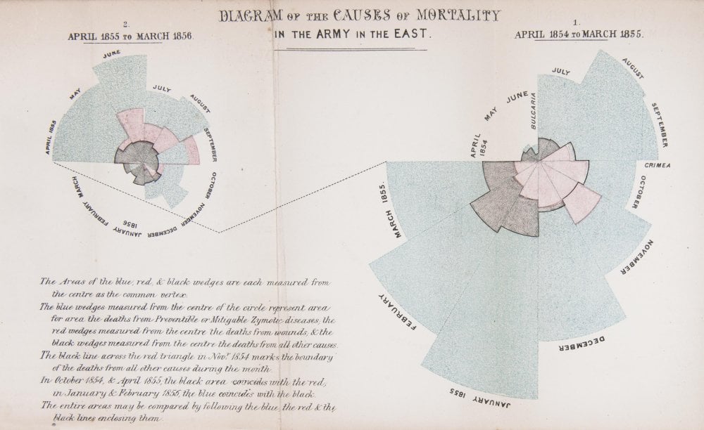
The first year (shown on the right of the diagram) was 1854–5, following her arrival in the region. The second (on the left) was 1855–6, after she had implemented a series of reforms to the hospital and nursing practices.
In her diagram, each wedge represented a month, and the area of the wedge showed the number of soldiers who had died that month. The blue area showed deaths from preventable diseases picked up in the terrible conditions at the Crimea. Red sections showed deaths from battlefield wounds. Black areas were deaths from other causes.
Readers could see two things. The first was that the reforms Nightingale implemented and campaigned for had made a huge positive difference to mortality. The second, and more shocking result, was that more soldiers died from preventable diseases during the war than from injuries.
Today, we are used to seeing statistics presented in graphical form. Infographics are common in newspapers, magazines and online. However, in 1850s Britain, the approach was revolutionary.
Credit: Thanks to the Science Museum, London for the inspiring image above and content.


